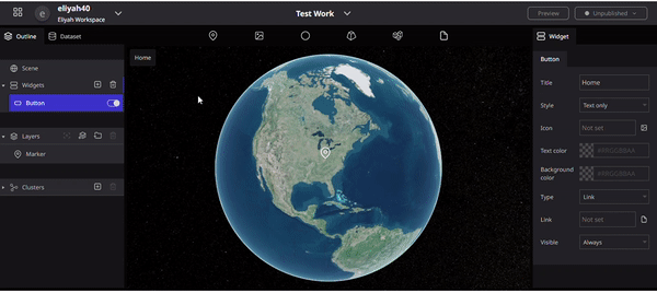
Button
Buttons are installed to trigger any event (such as camera movement, linking to an external website, etc.).
How to set up Button Widgets
Click on Widgets from the outline tab in the left panel, then click on the + icon and select Button.
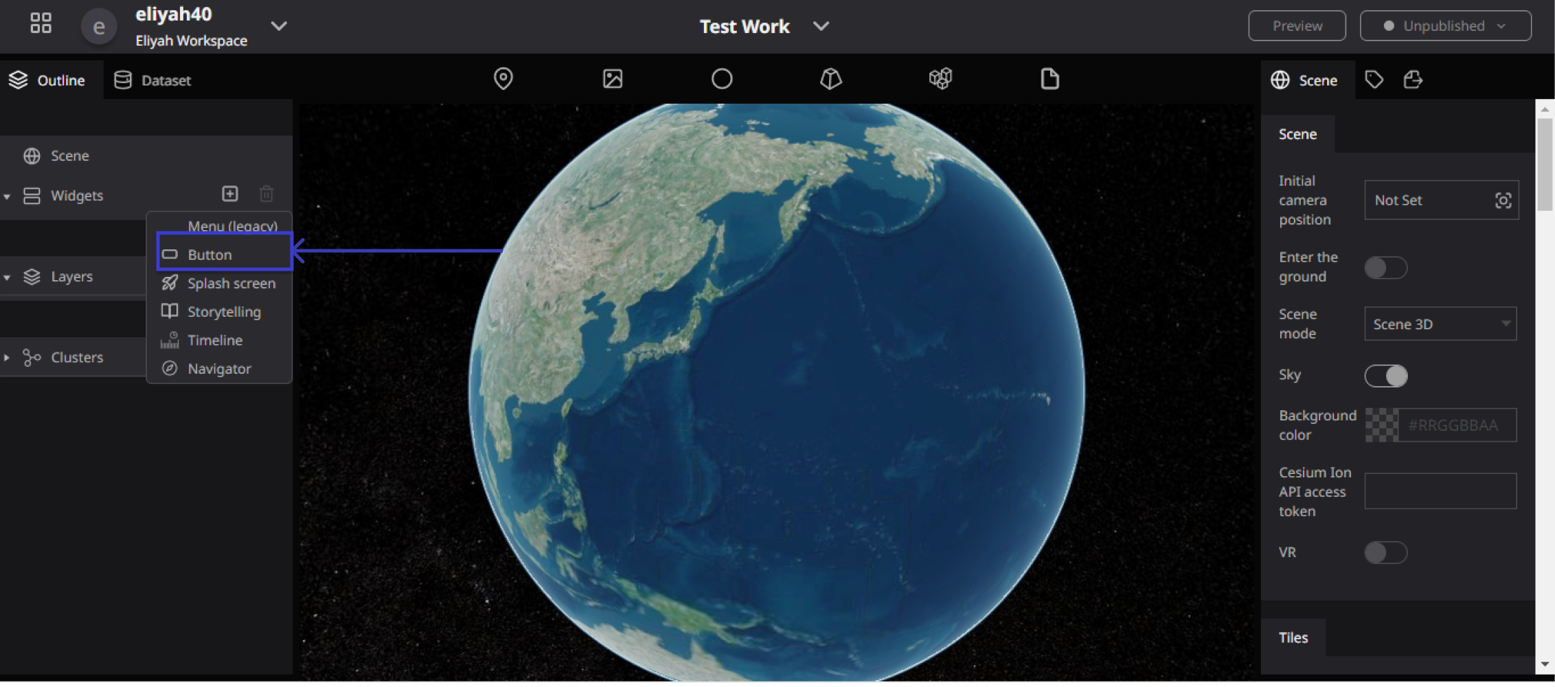
Illustration of Button Widgets
Button widgets and their properties
In a Button widget, you can set the following default items:
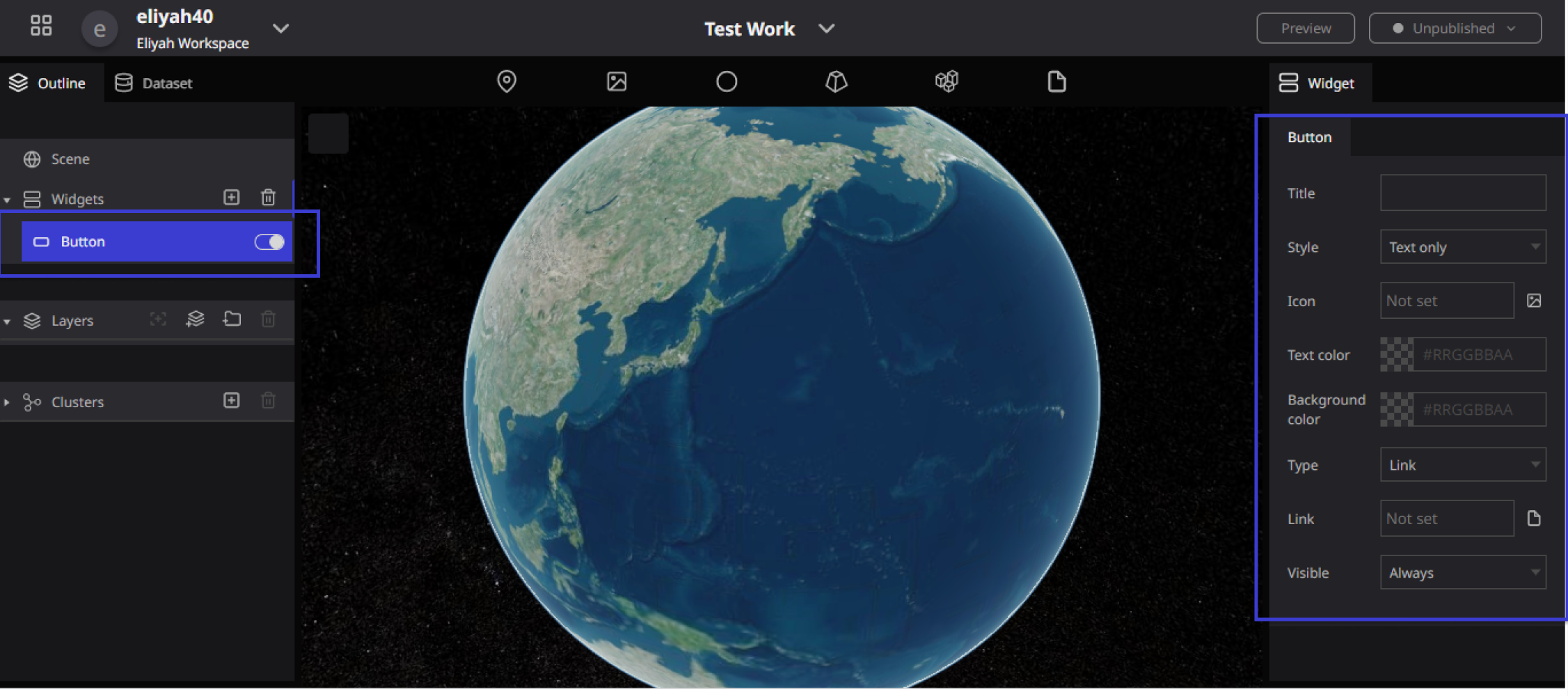
properties of Button Widgets
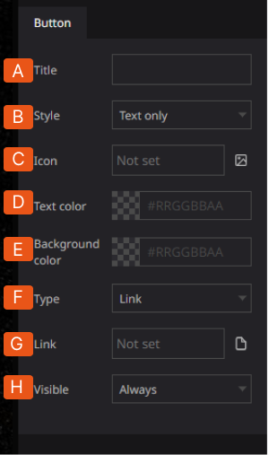
A. Title: Here users can enter the display name of the button. B. Display mode: Users can select to display the button as text only, icon, or text and icon. C. Icon: Users can display the button as an icon or text icon, you can specify using an image. D. Text Color: You can change the text color of the button. E. Background color: Users can change the background color of the button. F. Type: Users can choose the action when the button is clicked from the menu, link, and camera Flight.
The following are the actions that will take place: Link: The button becomes a link that directs to a specified address when clicked. Menu: When clicked, the button becomes a menu button that shows more menu options in the Menu List. Camera Flight: The button executes a camera movement when clicked.
G. Link: You can set the destination link by asset or resource URL. H. Display: You can switch the display/hidden state of the button from always, desktop only, and mobile only.
Setting up a Link Button
With the button widget, Users can set up a link button that will direct them to a specified web page.
Step 1: From the button's action options scroll down you will see Type, Then select "Link".

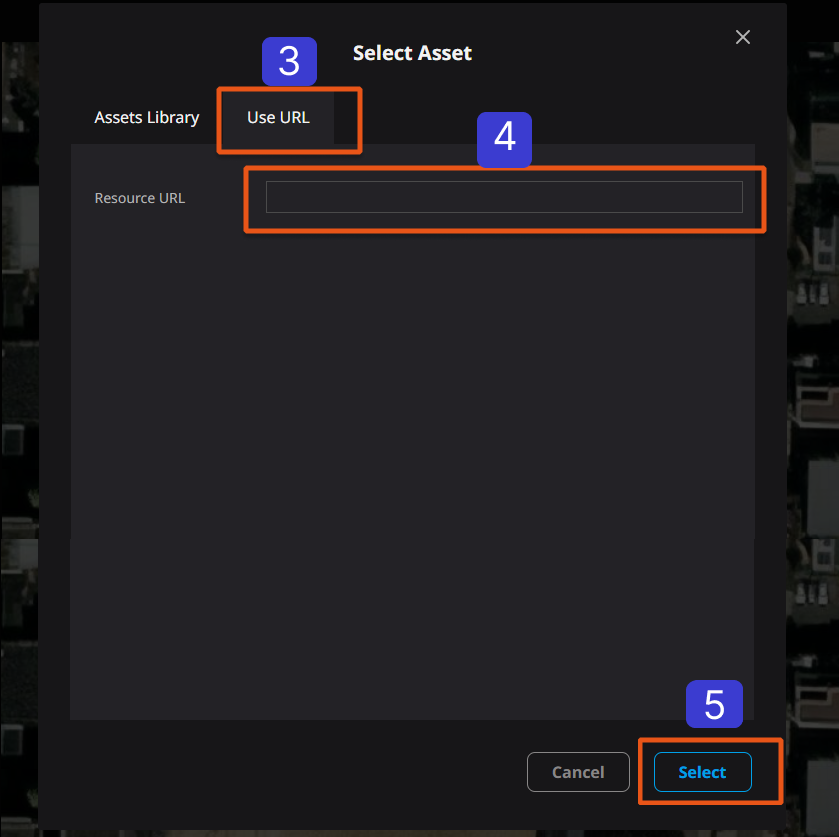
Step 2: Click on the link field and a resource selection window will appear. Select the URL tab.

Step 3: Input the address in the Resource URL field and click "Select" to complete the link button setup.
Setting up a Menu Button
Users can set up a menu button that expands when clicked. This allows you to compactly organize multiple actions.
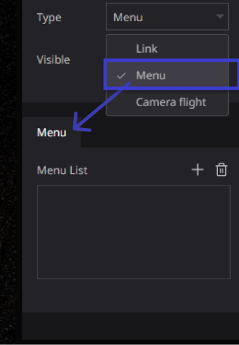
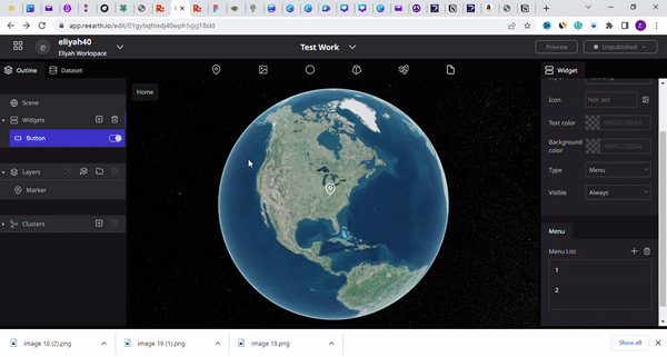
From the Type Button Properties, select Menu which is the second list in the Type Button properties.
After you have selected Menu, the Menu list will show up, Then click on the pulse Icon (+) to add a Menu list
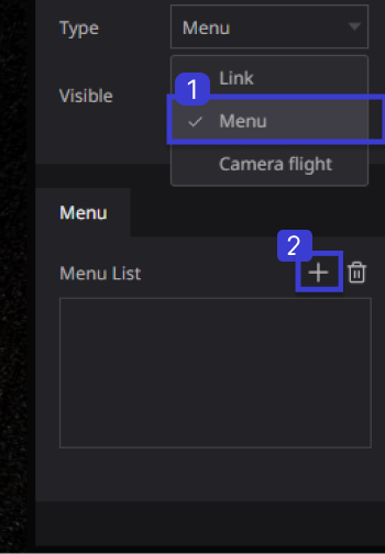
After you click on the + icon the Menu List will be listed according to how Menu List you want to ADD

Illustration of Menu Adding the Menu List
Placing the camera movement button
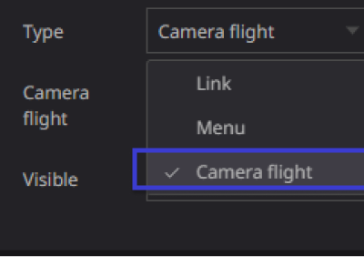
To place the Camera, From the Type Section of the Button Properties Click on it to open, then select Camera Flight, this is the third type on the type button widget
We will place a button that moves the camera to a specified position when clicked. This allows you to set the camera angle at the destination.
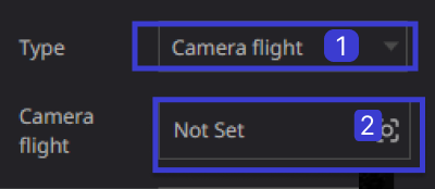
Select "Camera Flight" from the Type action. then click on “Not Set” to set the Camera angle settings.
- Camera: From the camera angle setting window, set the camera angle at the destination. Enter values for latitude and longitude, e.tc., or use the mouse to move the Re-Earth and click "Capture" to set the angle of view.
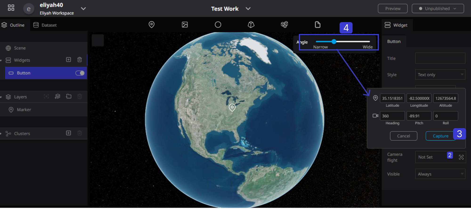
Illustration of the Button and Camera Flight
Visible: this is a property of the Button Widget that allows users to control when the button is displayed on the Re-Earth application.
There are three options for the "Visible" property: "Always," "Desktop," and "Mobile Only."
- If "Always" is selected, the button will be displayed on all devices, including desktop and mobile.
- If "Desktop" is selected, the button will only be displayed on desktop devices and not on mobile devices.
- If "Mobile Only" is selected, the button will only be displayed on mobile devices and not on desktop devices.

The "Visible" property can be useful for controlling the user experience of The Re-Earth application, especially if there are differences in functionality or layout between desktop and mobile devices.